Sample report · ubimaster-landingpage.lovable.app
Here's ubiMaster, generic scraped clean.
Built with Lovable. Below: what makes it read as AI-made, a redesigned homepage built from your real content, and the steps to make the changes yourself.

46/100
Humanness score
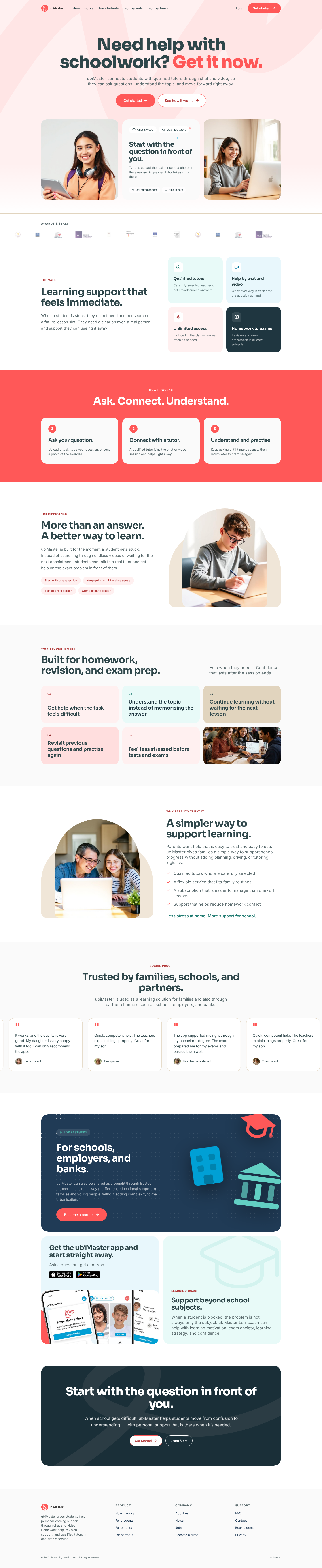
The copy is actually good: plain, specific, parent-friendly ("Ask a question, get a person."). The visual layer works against it. It reads as a default AI landing template: coral and mint pastels, Sora/Inter, rounded cards everywhere, a stock photo of a smiling teen, a 3-step "how it works" band. A parent landing here can't tell ubiMaster apart from a hundred edtech startups.
Three moves that matter most
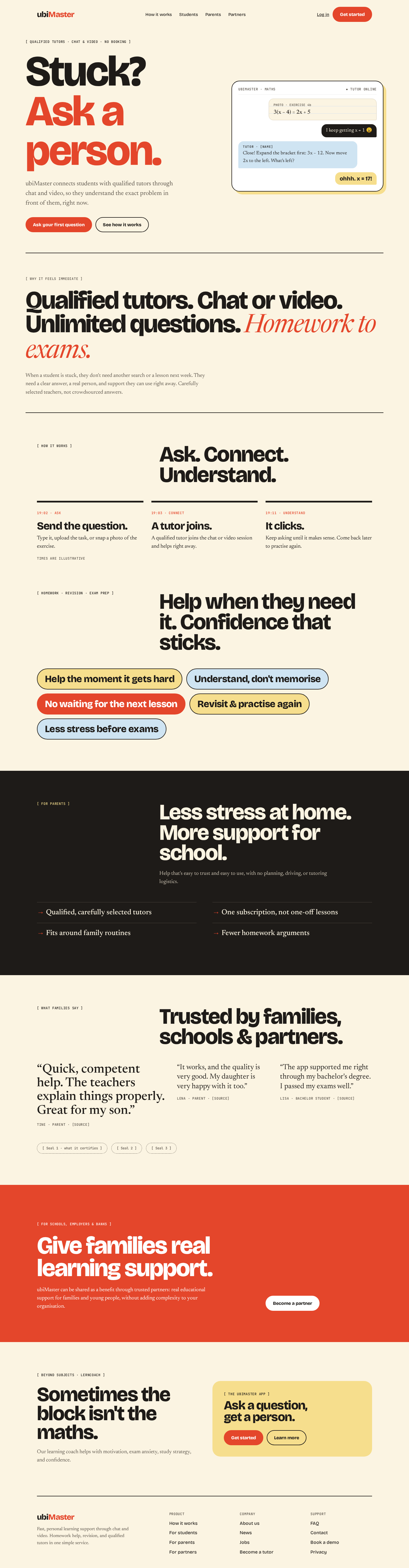
- Pick one idea and commit to it: "the moment it clicks." Every section should show a real stuck-to-understood moment (a question, the tutor's reply, the "oh!"), not describe tutoring in the abstract. That moment is ubiMaster's product. Pastel cards don't show it.
- Lead with the student's moment, not a slogan. The best line on the site ("Start with the question in front of you") is hidden inside a card. Make it the hero, and show a real question being answered.
- Fix the trust section. Testimonials repeat (the same "Quick, competent help…" quote shows up 4 times in the carousel), the "Awards & seals" logos are too small to read, and there are no names, numbers, or tutor faces.
Borrowed from the best
Picked from the Seadog library of award-winning sites to suit your industry. Here's what we took from each, and what we left behind.
| Reference | What we borrow | What we don't copy |
|---|---|---|
| Life Stories (lifestories.org) | Headline anchored bottom-left beside one human scene. Copy kept short | Their cinematic video |
| Aardvark Book Club | A warm, limited triad (butter, tomato, ink) and a chunky friendly display face, so it's joyful for families without pastel soup | Blob shapes, hot pink |
| Quaker School | Lead with values and real student moments, never stock smiles | Full-screen video |
| Bitnomial | [ BRACKETED MONO LABELS ] and an honest list statement for the facts parents check |
Trading-terminal tone |
| Union Boulangerie (wildcard) | Show the process (the actual worksheet) and bold colored tag-labels like shop signage | Bakery imagery |
The principles behind it: #1 one idea, #2 scale contrast, #5 process over stock, #6 show the product working, #8 asymmetry, #9 voice, #10 honest proof.
What to fix, in order
Fix first
| Area | What's on the site | Why it reads as generic or AI-made | Do instead |
|---|---|---|---|
| Template tells | Pastel card grids (mint, blush, sand, navy) in "The value" and "Why students use it" | Random pastel cards are Lovable's default way to look varied | One paper background, one ink color, one accent. Separate items with rules and numbers, not colored boxes |
| Trust | Carousel repeats the same 3 quotes. Authors are first names only ("Lena · parent") | Repetition looks like filler, and parents notice | Show each quote once. Add initial plus city, the subject helped, and star rating or source (App Store/Trustpilot) |
| Trust | "Awards & seals" row: ~14 logos at about 20px, unreadable | Logo soup tells the reader nothing | Show 3–4 seals at a legible size, each with one line explaining it ("Approved by …") |
| Hierarchy | H1 "Need help with schoolwork? Get it now." has its accent on "Get it now." | Urgent wording plus a gradient accent feels salesy, and the reassuring part gets lost | H1: "Stuck on homework? Ask a real tutor, right now." Put a human tutor reply next to it |
| Imagery | Stock teens with headphones and laptops, arch-masked photo, 3D emoji-style building and grad-cap icons in the partner panel | Stock photos plus 3D icons are classic generated-site markers | Show real product moments: a photographed worksheet with a tutor's annotation, or real tutor portraits. Drop the 3D icons |
Important
| Area | Finding | Do instead |
|---|---|---|
| Typography | Sora 800 headlines plus Inter body is a stock AI pairing. Headlines are 76px and heavy everywhere, so nothing stands out | Chunky, friendly display (Bricolage Grotesque 800) at true poster scale, a warm text serif for reading (Newsreader), and mono [ labels ] (JetBrains Mono) for facts |
| Color | Coral #FF5A5F-style CTA plus mint, blush and navy, all at the same visual weight | Cream #FBF4E2, ink #1E1B18, tomato #E4462B as the one accent. Butter #F6DE8D and sky #CFE4F2 only for chat bubbles (meaning: student vs tutor) |
| Layout | Every section is centered heading → card grid → repeat. The full-bleed coral "How it works" band is the most generic section on the page | Use an editorial asymmetric grid. Show "How it works" as a timestamped timeline (19:02 Ask → 19:03 Connect → 19:11 It clicks) |
| Copy | Duplicate sections: "Start with the question in front of you" appears twice. "More than an answer. A better way to learn." is filler | Use each idea once. Swap filler headlines for concrete ones ("We explain it until it clicks.") |
| Structure | Students, parents, and partners are all mixed into one scroll | Use clearly labeled chapters: For students / For parents / For schools & partners |
Polish
- Accessibility: coral-on-white buttons and pale grey small text (~#8a9a9c on white) likely fail WCAG AA at 13px. Eyebrow labels at ~10px are too small. Make sure carousel quotes can be paused and aren't duplicated for screen readers.
- Meta: the title is good. Add an OG image that isn't a generic screenshot.
- Footer: "Get Started / Learn More" with title-case buttons doesn't match the sentence-case CTAs above. Make them consistent.
- "ubiMaster Lerncoach" mixes German and English. Either explain it ("Learning coach") or localize the whole site.
What we kept
Every real section and line of meaning: hero promise, the 4 value points, 3 steps, the 5 student outcomes, the 4 parent reasons, testimonials (deduplicated), partners, the app, Lerncoach, the final CTA, and the footer links. Nothing invented. Placeholders are marked [ ].
Your homepage, redesigned
Built from your real content, with nothing invented. Drag to compare, or open the live page.
 BeforeAfter
Make the changes yourself
The idea to build around: “the moment it clicks.” Plan on about 1–2 hours in Lovable. Keep redesign.html open as the visual reference.
Step 1
Master prompt (Lovable / Cursor / v0 / Bolt)
Restyle the homepage around one idea: "the moment it clicks". Keep all existing sections and meaning.
FONTS: Google Fonts Bricolage Grotesque (800 display, 500 UI), Newsreader (body text, 19px, plus italics), JetBrains Mono 500 (12px uppercase labels written as "[ LABEL ]"). Remove Sora and Inter.
COLORS: cream #FBF4E2 page, ink #1E1B18 text, tomato #E4462B = the only accent (primary buttons, key words). Butter #F6DE8D and sky #CFE4F2 ONLY for chat bubbles and tag pills. Delete all mint/blush/sand pastel cards, the coral full-width band, gradients and soft shadows.
HERO (2 cols, aligned to bottom): left = mono label "[ Qualified tutors · chat & video · no booking ]", giant H1 "Stuck?" with "Ask a person." on a second line in tomato (clamp 72px–168px, line-height .92), existing lede, pill buttons "Ask your first question" (tomato) and "See how it works" (outline). Right = a white rounded chat card (2px ink border, 10px butter offset shadow): a photo-of-worksheet bubble "3(x − 4) = 2x + 5", student bubble "I keep getting x = 1", tutor bubble (sky) explaining the first step, student bubble (butter) "ohhh. x = 17!". Remove all stock photos from the hero.
FACTS: replace the 4 value cards with one giant H2 statement between 2px ink rules: "Qualified tutors. Chat or video. Unlimited questions. Homework to exams." (last phrase in Newsreader italic tomato) + one paragraph.
HOW IT WORKS: a 3-column timeline, each with a 6px ink top border and a mono timestamp label (19:02 · Ask / 19:03 · Connect / 19:11 · Understand).
STUDENT OUTCOMES: big rounded pill "signs" cycling butter / sky / tomato.
PARENTS: ink background section, 2-column list in Newsreader 26px with "→" bullets.
TESTIMONIALS: no carousel; 3 unique quotes, the first one larger (44px). Seals as 3 dashed pills with explanations.
PARTNERS: full-bleed tomato section, white text, white pill button. Remove the 3D icons.
LERNCOACH + APP: two columns, the app CTA in a butter rounded card.
A11y: AA contrast, 3px tomato focus ring, chat card has an aria-label describing the exchange.
Step 2
Section-by-section prompts
- "Swap fonts/colors to [tokens]; delete every pastel card background and the coral band."
- "Rebuild the hero: huge 'Stuck? / Ask a person.' bottom-left and a chat-thread card on the right showing a real question being solved."
- "Turn the four value cards into one giant sentence between two thick rules."
- "Make How it works a 3-step timeline with timestamps."
- "Turn the 5 student outcomes into large colored pill labels."
- "Remove the testimonial carousel and duplicates; show 3 quotes, first one big."
- "Make the partner section a solid tomato band and remove the 3D icons."
Step 3
CSS tokens
:root{--cream:#FBF4E2;--butter:#F6DE8D;--ink:#1E1B18;--soft:#5B544B;--tomato:#E4462B;--sky:#CFE4F2;
--font-display:'Bricolage Grotesque',system-ui,sans-serif;--font-text:'Newsreader',Georgia,serif;--font-mono:'JetBrains Mono',monospace}
body{background:var(--cream);color:var(--ink);font:19px/1.55 var(--font-text)}
h1,h2,h3{font-family:var(--font-display);font-weight:800;letter-spacing:-.035em;line-height:.92}
.btn{border-radius:999px;font-family:var(--font-display);font-weight:800}
Step 4
Copy changes (before → after)
Before After Need help with schoolwork? Get it now. Stuck? Ask a person. Get started (hero) Ask your first question Learning support that feels immediate. + 4 cards Qualified tutors. Chat or video. Unlimited questions. Homework to exams. Ask your question / Connect with a tutor / Understand and practise. Send the question. / A tutor joins. / It clicks. More than an answer. A better way to learn. Help when they need it. Confidence that sticks. A simpler way to support learning. Less stress at home. More support for school. For schools, employers, and banks. Give families real learning support. Support beyond school subjects. Sometimes the block isn't the maths. Repeated "Start with the question in front of you" Delete (the hero chat shows it instead) Step 5
Checklist
- The example chat uses a real (anonymized) exchange, with the student's permission
- No pastel cards, gradients, stock teens or 3D icons left
- Each testimonial appears once and has a source
- Phone check: the H1 still fits (clamp minimum 72px) and the chat card stacks under it
- Publish → Publish changes
Want it done properly? Work with Seadog, the studio behind Barnacle, and get your Barnacle order fully credited toward a project booked within 60 days.
seadog.design ↗