Sample report · maaitlunghau.lovable.app
Here's Vaultline, generic scraped clean.
Built with Lovable. Below: what makes it read as AI-made, a redesigned homepage built from your real content, and the steps to make the changes yourself.

38/100
Humanness score
The page is competently built, and that's the problem. It's a section-by-section copy of a well-known SaaS homepage: black hero with a warm orange glow, a "NEW … now GA" pill, a logo marquee, three stat cards, a code tab block, tabbed solutions, a testimonial carousel, a resource grid, and a 9-column footer. Developers have seen this exact page hundreds of times, and nothing about it says Vaultline.
Three moves that matter most
- Own the name with a real artifact: the access log. Identity is a record of who was let in, when, and with what scope. Make that record the visual language: a grid-paper console, monospaced entries, a highlighter on what matters, and red for denied.
- Make the code the hero. The tagline promises login in 10 minutes, so put the 6-line SDK snippet next to the H1 instead of four scrolls down.
- Earn trust with real proof. The stats (41B+, 6,400+ tenants), customer logos (Fluxline, Parallax, Nimbus…), testimonials, and the "Named a Leader in the 2026 Identity Platforms report" banner look invented. For a security product, fake proof does more damage than anything else on the page.
Borrowed from the best
Picked from the Seadog library of award-winning sites to suit your industry. Here's what we took from each, and what we left behind.
| Reference | What we borrow | What we don't copy |
|---|---|---|
| Bitnomial (regulated exchange) | A list as the H1 ("Passkeys. MFA. SSO. Agent auth."), [ BRACKETED MONO ] compliance labels, one signal accent on white |
Their inktrap font and orange line art |
| Ardor | Dot-matrix numerals (Doto) for machine-like data, which gives an agent product a terminal voice without dark mode | ASCII decoration, centered prompt box |
| Replicas | A fine grid-paper backdrop that reads as an engineer's notebook | Black background, mint |
| Cerebrium | Commit to a non-blue accent: chartreuse highlighter instead of SaaS orange or blue | Pink 3D ribbon |
| Oath (wildcard) | Pair the technical claims with one warm human note, a short founder-style line | Soil video |
The principles behind it: #1 one idea, #2 scale contrast, #4 one accent like a highlighter, #6 show the product (code + live log), #7 editorial frames and mono metadata, #10 honest proof.
What to fix, in order
Fix first
| Area | What's on the site | Why it reads as generic or AI-made | Do instead |
|---|---|---|---|
| Trust | "41 B+ logins", "99.99 %", 5 named testimonials from Northwind/Octagram/Lumen/Co, an analyst "Leader" badge | Placeholder companies plus round big numbers are the clearest sign of a generated site. Security buyers check this | Use real numbers or none. Replace with verifiable proof: SOC 2 status, open-source SDK stars, a public status page, a changelog |
| Template tells | Dark hero with radial orange glow, "NEW" pill, "Edit with Lovable" badge left visible | It's the stock "AI SaaS" hero | A light, paper-toned hero. Remove the Lovable badge (Project settings → hide badge) |
| Hierarchy | The SDK code block, the most persuasive asset, sits in section 3 | Developers decide in the first screen | Put the H1 and a working snippet side by side above the fold |
| Layout | Every section uses the same pattern: eyebrow → H2 → card row | Even rhythm means nothing stands out | Number the chapters (01 Install, 02 Solutions, 03 Proof, 04 Read), use different layouts per section, and use rules instead of cards |
Important
| Area | Finding | Do instead |
|---|---|---|
| Typography | Archivo 800 for every heading and body. One heavy grotesk reads as "template" | Familjen Grotesk (a grotesk with character) for display, IBM Plex Sans for body, IBM Plex Mono for labels and code, and Doto dot-matrix only for numbers |
| Color | Black + Lovable-default orange #F97316-ish + white cards | Off-white #F4F4EF with a 24px grid, ink #111111, chartreuse #C8F03C as the only accent (highlighter), red #D63B2F only for denied/out-of-scope states |
| Copy | "Typed to the teeth", "ate our legacy hash format for breakfast". Bits of voice, but the H1 "Identity for every human, every app, every agent." is triple-parallel AI phrasing | H1: "Login, MFA and agent auth, in one tiny SDK." Keep the playful lines and cut the slogans |
| Navigation | 5 mega-menu buttons + EN + Login + Sign up + Contact sales = 9 items | Docs · Pricing · Customers · Log in · Start free |
| Footer | 9 link columns (~40 links) for a one-page product | 4 columns max |
Polish
- Accessibility: nav button text is white at 64% opacity on black (computed
oklab(... / 0.64)), which is borderline for 14px text. The logo marquee moves with no pause control (WCAG 2.2.2). Tab buttons needrole="tab"/aria-selected. - Testimonials use straight
"quotes with stray spaces (" We moved…"). Use proper “ ” quotes. - "99.99 %" and "41 B+" have stray spaces. Write "99.99%" and "41B+".
What we kept
Product name, positioning, all four solution segments (AI Agents, AI Tools, B2B, B2C), the agent-identity features, the SDK snippet, resources, and the final CTA. Stats, logos, and quotes are kept as clearly marked placeholders to be replaced with real proof.
Your homepage, redesigned
Built from your real content, with nothing invented. Drag to compare, or open the live page.
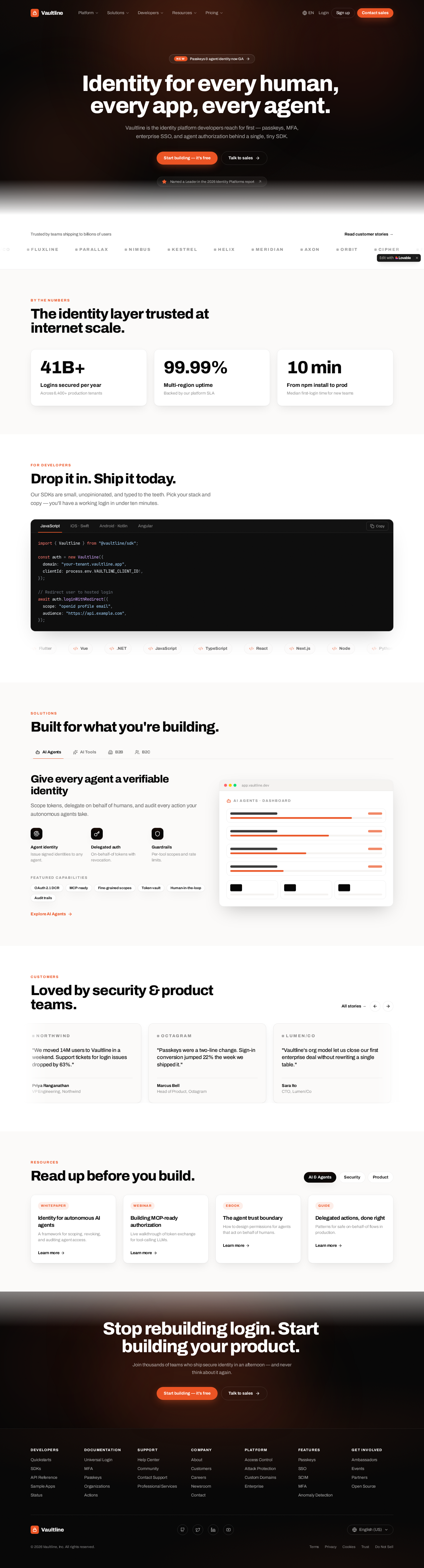
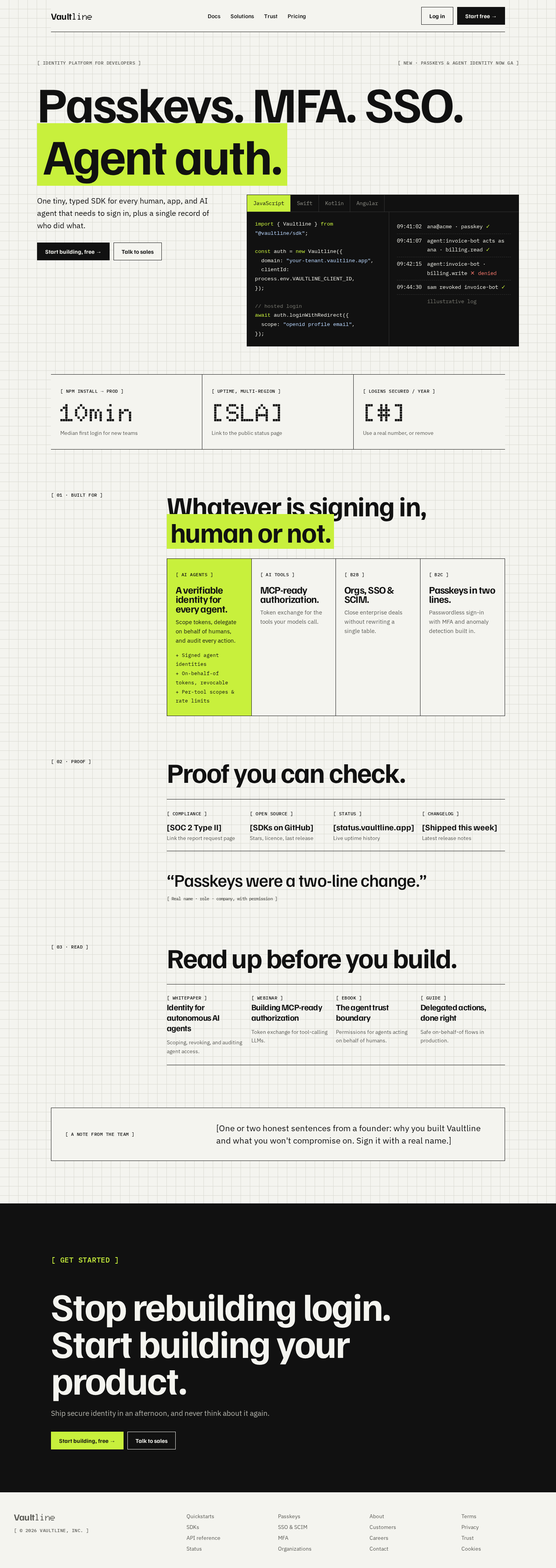 BeforeAfter
Make the changes yourself
The idea to build around: “the access log.” Plan on about 1–2 hours. Keep redesign.html open as the reference.
Step 1
Master prompt (Lovable / Cursor / v0 / Bolt)
Restyle the homepage around one idea: "the access log". Keep product copy unless told otherwise.
FONTS: Familjen Grotesk 700 (display), IBM Plex Sans (body 17px), IBM Plex Mono 500 (12px uppercase labels written "[ LABEL ]" and code), Doto 900 (dot-matrix) ONLY for big numbers and the "line" in the logo. Remove Archivo.
COLORS: page #F4F4EF with a 24px grid of 1px #DADAD2 lines, ink #111, chartreuse #C8F03C as the only accent, used like a highlighter (<mark> on key words, active tab, first card, primary button in the dark section). Red #D63B2F only for denied states. Remove the dark hero, the orange glow and all orange.
SHAPES: square corners, 1.5px ink borders, no shadows, no gradients.
NAV: logo · Docs · Solutions · Trust · Pricing · Log in · Start free.
HERO: a row of two mono labels (left "[ Identity platform for developers ]", right "[ New · passkeys & agent identity now GA ]"), then a giant H1 list "Passkeys. MFA. SSO." with "Agent auth." on line 2 highlighted in chartreuse. Below in 5/7 columns: lede + buttons on the left; on the right a black console with language tabs, split into the SDK code and a live access log (passkey login ✓, agent delegation ✓, out-of-scope write ✕ denied, revoke ✓).
NUMBERS: 3-column ruled strip, Doto numerals; unverifiable stats become [placeholders].
SOLUTIONS: 4 segments side by side in one bordered strip (first one chartreuse), no tabs.
PROOF: 4 checkable items (SOC 2, GitHub SDKs, status page, changelog) + max one real quote. Delete the logo marquee, fake logos, analyst badge and testimonial carousel.
Add a short founder note box before the final CTA. Final CTA on ink with a chartreuse primary button. Footer: 4 columns max. Hide the "Edit with Lovable" badge.
Step 2
Section prompts
- "Swap fonts, colors and the grid background to [tokens]; remove all orange and the dark hero glow."
- "Make the H1 a stacked list 'Passkeys. MFA. SSO. Agent auth.' and highlight the last item."
- "Put the SDK code and a 4-line access log side by side in one console in the hero."
- "Show all 4 solution segments in one row; delete the tabs."
- "Replace testimonials and logos with a 4-item 'Proof you can check' row."
- "Add a founder note box above the final CTA."
Step 3
CSS tokens
:root{--paper:#F4F4EF;--ink:#111;--soft:#5C5C57;--line:#DADAD2;--hi:#C8F03C;--red:#D63B2F;
--font-display:'Familjen Grotesk',sans-serif;--font-body:'IBM Plex Sans',sans-serif;--font-mono:'IBM Plex Mono',monospace;--font-dot:'Doto',monospace}
body{background:var(--paper);background-image:linear-gradient(var(--line) 1px,transparent 1px),linear-gradient(90deg,var(--line) 1px,transparent 1px);background-size:24px 24px}
mark{background:var(--hi);color:var(--ink)}
Step 4
Copy changes
Before After Identity for every human, every app, every agent. Passkeys. MFA. SSO. Agent auth. Vaultline is the identity platform developers reach for first… One tiny, typed SDK for every human, app, and AI agent that needs to sign in, plus a single record of who did what. Built for what you're building. Whatever is signing in, human or not. Loved by security & product teams. + 5 quotes Proof you can check. + 1 real quote 41 B+ / 99.99 % [real #] / [SLA] linked to status page Trusted by teams shipping to billions of users Delete Step 5
Checklist
- No unverifiable numbers, logos, badges or quotes remain
- Chartreuse appears only as highlight or active state (≤5 places per screen)
- Text never sits directly on chartreuse at small sizes unless it's ink (AA passes)
- Lovable badge hidden · Publish → Publish changes
Want it done properly? Work with Seadog, the studio behind Barnacle, and get your Barnacle order fully credited toward a project booked within 60 days.
seadog.design ↗